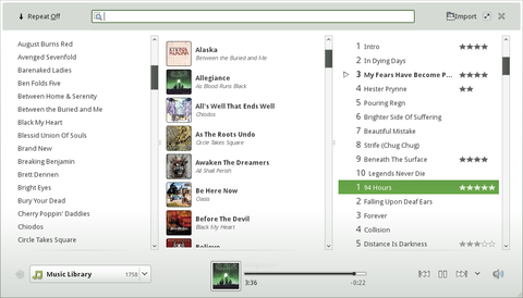
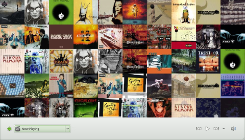
At the Gran Canaria Desktop Summit last week I demoed my new work-in-progress Netbook-focused interface to Banshee called Cubano.
Cubano is designed with the Netbook in mind, but is certainly not limited to such a device. I prefer this clean and simple interface to the more traditional Banshee interface already, even on my desktop. Cubano is more about experiencing your music than managing it.
I am aiming to introduce visual metadata (photos, colors) and simple whitespace as UI elements to separate and emphasize content instead of the hard lines from traditional toolkit widgets.
However, even with a minimal interface you don't lose any of the power to which you may be accustomed from the traditional Banshee interface.
I must stress that not all of the UI concepts here are solidified or indeed implemented. A few quick things to note about what will change in the very near future:
- The painful source combo box will go away, don't worry! It was just a widget that already existed in Banshee that I was able to easily reuse to connect the dots.
- We're working on a grid view for artists and albums.
- I don't care for the header either -- it will receive much attention in due time.
Feel free to checkout Cubano's source code, but you'll also need clutter, clutter-gtk, and clutter-sharp from Clutter git master, and Banshee from GNOME git master. Bleeding edge!
Lastly, let me further stress that Cubano does not replace Banshee as we know it today. It only augments it. Cubano simply provides a different user experience on top of the existing Banshee platform.
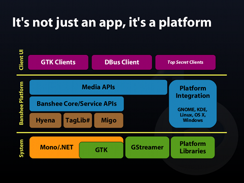
Platform you say?
Trendy, I know. Banshee is in its third generation now. It's been designed to be completely extensible, and major components are abstracted and organized in reusable ways.
As such we've fostered the development of many Mono/.NET libraries, most of which are not specific to Banshee and can easily be reused in other projects.
We essentially glue everything together with Mono.Addins, and build user interfaces on top of it all. What this means is the traditional user interface we're used to in Banshee is an astonishingly small 875 lines of C# code.
Therefore, it's conceivable, and even quite easy to think of Banshee as not just an application, but a platform for building new applications and user experiences. Ergo, Cubano.

For those interested in some of the wider details of the design and utility behind Banshee as platform, I recently had lovely a discussion on the topic with Scott Hanselman -- Senior Program Manager in the Developer Division at Microsoft -- for his podcast, Hanselminutes.
F-Spot
A major take-away from this platform discussion at GCDS last week is talk of re-basing the core of F-Spot -- the wonderful photo management application -- on top of Banshee itself.
The goal is simply to allow F-Spot to benefit from Banshee's mature and maintained core, which provides many of the underpinning necessities in F-Spot, and allow the F-Spot developers to focus on the more interesting task of organizing and manipulating Photos.
While nothing is set in stone, I have a simple proposal:
- Re-base F-Spot's non-UI core on Banshee's non-UI core.
- Implement basic photo importing, tagging, and viewing as a Banshee extension (an optional feature). This would mean showing photos in Banshee like we do for videos.
- With Banshee/Cubano supporting basic photo management, grow the F-Spot user interface and experience to be more like that of professional tools such as Adobe Lightroom -- an experience missing today on the Linux desktop.
GCDS Slides
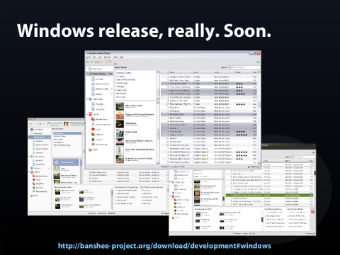
The talk I gave at GCDS covered the above and a bit more. The slides are available here, but may be a bit terse if you weren't in the audience. I'm not sure if my talk was recorded or not.
Nevertheless, for your perusal:


