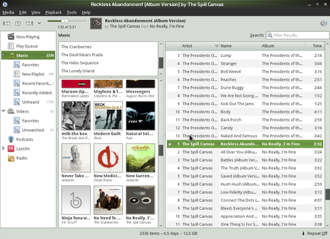
Spread out over a number of hours over the last few weeks I've been working on making our high-performance list view in Banshee also handle grid-style layouts.
That is, all the benefits of our polished list widget with a new look and feel! I'm making the widget more clever and abstracted about layout and rendering so it can be more inviting to users. In fact, you can even live-toggle between layout modes (e.g list and grid) without losing any state.
This effort provides a more visually immersing and space-conscious view for your collection of albums. This big step forward is the groundwork for presenting other media collections in a friendlier way -- video thumbnails, movie box covers, audio books, photos...

The new grid layout mode for the album browser.
There are still a few quirks to work out regarding interaction (different maths for keyboard navigation), and some more polish to add on the rendering side of things, but I am very close to merging this work to master in git.
The code is being developed in the grid branch in git for those who would like to try it out. Poke me on IRC if you find problems, but I probably am already well aware -- again, it's not merged to master because it's not RC worthy yet -- but it's ready for some broader testing!
Thoughts? Suggestions? Complaints? Hopes and dreams? I'm super excited about finally having this land, and it's been an enjoyable hack to implement.